这篇文章给大家分享的是有关怎么用纯CSS 实现一个没有DOM元素的动画效果的内容。小编觉得挺实用的,因此分享给大家做个参考,一起跟随小编过来看看吧。
代码解读
没有dom元素,直接写css。
设置页面空间:
body{
position:fixed;
margin:0;
width:100vw;
height:100vh;
}
用伪元素设置背景图案:
body::before{
content:'';
position:fixed;
width:200vmax;
height:200vmax;
background-color:steelblue;
color:turquoise;
background-image:
linear-gradient(
45deg,
currentColor25%,
transparent25%,transparent75%,
currentColor75%),
linear-gradient(
45deg,
currentColor25%,
transparent25%,transparent75%,
currentColor75%);
background-position:00,5vmax5vmax;
background-size:10vmax10vmax;
平移背景图案:
body::before{
top:50%;
left:50%;
animation:
9smoveinfiniteease-in-outalternate;
}
@keyframesmove{
from{
left:-40%;
top:-40%;
}
to{
left:-60%;
top:-60%;
}
}
让背景图案转动起来:
body::before{
animation:
9smoveinfiniteease-in-outalternate,
9s-1.5srotatinginfiniteease-in-outalternate;
}
@keyframesrotating{
to{
transform:rotate(180deg);
}
}
平移页面:
body{
top:50%;
left:50%;
animation:
3smoveinfiniteease-in-outalternate;
}
缩放页面:
body{
animation:
3smoveinfiniteease-in-outalternate,
3szoominfiniteease-in-outalternate;
}
@keyframeszoom{
to{
transform:scale(10);
}
}
最后,增加变色效果:
@keyframesrotating{
to{
transform:rotate(180deg);
filter:hue-rotate(1turn);
}
}
大功告成!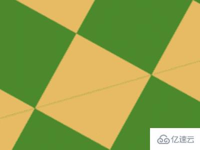
感谢各位的阅读!关于“怎么用纯CSS 实现一个没有DOM元素的动画效果”这篇文章就分享到这里了,希望以上内容可以对大家有一定的帮助,让大家可以学到更多知识,如果觉得文章不错,可以把它分享出去让更多的人看到吧!
免责声明:本站发布的内容(图片、视频和文字)以原创、转载和分享为主,文章观点不代表本网站立场,如果涉及侵权请联系站长邮箱:is@yisu.com进行举报,并提供相关证据,一经查实,将立刻删除涉嫌侵权内容。


