1.rem的布局
em单位式参照元素自身的文字大小来设置尺寸,rem指的是参照根节点的文字大小,根节点值的是HTML标签,设置HTML标签的文字大小,其他元素相关尺寸设置用rem,这样,所有元素都有了统一的参照标准,改变HTML文字的大小,就会改变所有元素用rem设置的尺寸大小。
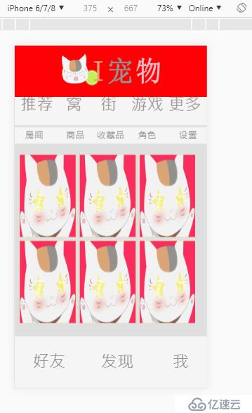
例子:Ipet移动端页面
<!doctype html>
<html>
<head>
<meta charset="utf-8">
<meta name="viewport" content="width=device-width, user-scalable=no, initial-scale=1.0, maximum-scale=1.0, minimum-scale=1.0">
<link rel="stylesheet" type="text/css" href="css/main.css">
<script type="text/javascript" src=""></script>
<title>Ipet移动端</title>
</head>
<body>
<div class="wrap">

    <div class="header clearfix">  <!--解决塌陷-->
    <a href=""><img src="images/logo.png" alt="logo" class="logo"></a>  <!--设置成块-->
    <a href=""></a>
</div>
    <div class="center">

        <div class="second">

            <a href="#" class="a01">推荐</a>
            <a href="#" class="a02">窝</a>
            <a href="#" class="a03">街</a>
            <a href="#" class="a04">游戏</a>
            <a href="#" class="a05">更多</a>
        </div>
        <div class="third">
            <a href="#" class="a01">房间</a>
            <a href="#" class="a02">商品</a>
            <a href="#" class="a03">收藏品</a>
            <a href="#" class="a04">角色</a>
            <a href="#" class="a05">设置</a>
        </div>
        <div class="forth">
            <ul class="clearfix">
                <li><a href="#"></a></li>
                <li><a href="#"></a></li>
                <li><a href="#"></a></li>
                <li><a href="#"></a></li>
                <li><a href="#"></a></li>
                <li><a href="#"></a></li>
            </ul>
        </div>
    </div>
    <div class="footer">

        <a href="#" class="a01">好友</a>
        <a href="#" class="a02">发现</a>
        <a href="#" class="a03">我</a>
    </div>
</div>
</body>
</html>
css文件如下:
/ CSS Document /
/logo/
body{
margin: 0px;
}
.header{
height: 100px;
background-color: #FF0004;
}
.logo{
display: block;
width: 375px;
height: 100px;
margin: 0px auto 0px;
}
.clearfix:before{
content: "";
display: table;
}
/全屏背景/
.wrap{
/width: 100%;/
position: absolute;
left: 0; /把屏幕拉开/
top: 0;
right: 0;
bottom: 0;
background-color: #dfdfdf;
}
/中部块/
.center{
background-color: #dfdfdf;
position: absolute;
left: 0;
right: 0;
top: 6.25rem;
bottom: 6.25rem;
overflow-y: auto; /滚动/
overflow-x: hidden; /不出现x轴滚动条/
}
.second{
height: 5rem;
background-color: #f5f5f4;
text-align: center;
line-height: 5rem;
font-size: 32px;
position: absolute;
right: 0;
left: 0;
}
.second a{
position: absolute;
text-decoration: none;
color: #97918d;
}
.second a:hover{
color: #dba675;
}
.second .a01{
left: 0.69rem;
}
.second .a02{
left: 6.25rem;
}
.second .a03{
right: 11rem;
}
.second .a04{
right: 5.25rem;
}
.second .a05{
right: 0.69rem;
}
.center .third{
height: 2rem;
background-color: #f5f5f4;
text-align: center;
position: absolute;
left: 0;
right: 0;
top: 5.25rem;
font-size: 18px;
line-height: 2rem;
}
.center .third a{
text-decoration: none;
color: #97918d;
position: absolute;
}
.center .third a:hover{
color: #dba675;
}
.center .third .a01{
left: 1.25rem;
}
.center .third .a02{
left: 6.25rem;
}
.center .third .a03{
left: 10rem;
}
.center .third .a04{
left: 15rem;
}
.center .third .a05{
left: 20rem;
}
.center .forth{
height: 22.8rem;
position: absolute;
top: 7.5rem;
left: 0;
right: 0;
/background-color: aqua;/
}
.center .forth ul{
height: 22rem;
width: 22.2rem;
margin: 0.625rem;
/background-color: antiquewhite;/
list-style: none;
padding: 0;
}
.center .forth ul li{
width: 6.8rem;
height: 10rem;
float: left;
background-color: gold;
margin-right: 0.5rem;
margin-top: 0.5rem;
}
.center .forth ul li a{
display: block;
height: 10rem;
background: url("../images/Ipet移动端网页_01.png") left top no-repeat;
background-size: 6.8rem 10rem;
}
/底部块/
.footer{
width: 100%;
height: 6.25rem;
background-color: #f5f5f4;
position: absolute;
left: 0;
right: 0;
bottom: 0;
text-align: center;
line-height: 6.25rem;
font-size: 32px;
}
.footer a{
/display: block;
float: left;/
text-decoration: none;
color: #97918d;
position: absolute;
}
.footer a:hover{
color: #dba675;
}
.footer .a01{
left: 2.2rem;
}
.footer .a02{
left: 10.5rem;
}
.footer .a03{
right: 2.2rem;
}
总结:排版的时候技巧缺乏,margin和position都不够熟练,rem要学到js才能实际应用。缺少两个工具,一个是rem转换插件,二是js来实现等比缩放
方法:上一级的宽可以用百分比,下一级margin:auto可以居中,图片就用background&background-size,文字居中使用text-align
免责声明:本站发布的内容(图片、视频和文字)以原创、转载和分享为主,文章观点不代表本网站立场,如果涉及侵权请联系站长邮箱:is@yisu.com进行举报,并提供相关证据,一经查实,将立刻删除涉嫌侵权内容。


