这篇文章主要介绍BootStrap中如何实现模态框,文中介绍的非常详细,具有一定的参考价值,感兴趣的小伙伴们一定要看完!
bootstrap的弹出层
bootstrap弹出层有多种触发方式,以下是我用到的几种方式:
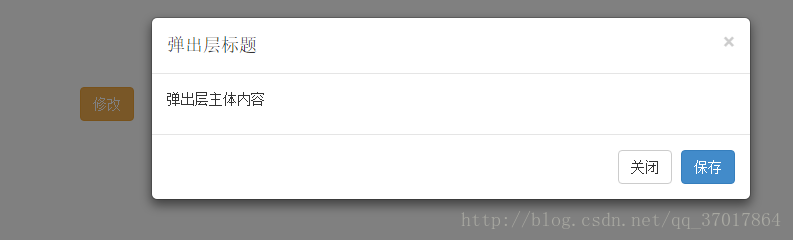
1.方法一:button中属性触发
注意:button中的data-target内容应该和要和弹出层中的id保持一致
data-target=”#mymodal-data”——– id=”mymodal-data” <!--在button上绑定触发弹出层的属性--> <button class="btn btn-primary delete" data-toggle="modal" data-target="#mymodal-data" data-whatever="@mdo"> 修改 </button> <!-- 模态弹出窗内容 --> <div class="modal" id="mymodal-data" tabindex="-1" role="dialog" aria-labelledby="mySmallModalLabel" aria-hidden="true"> <div class="modal-dialog"> <div class="modal-content"> <div class="modal-header"> <button type="button" class="close" data-dismiss="modal"> <span aria-hidden="true">×</span> <span class="sr-only">Close</span> </button> <h5 class="modal-title">弹出层标题</h5> </div> <div class="modal-body"> <p>弹出层主体内容</p> </div> <div class="modal-footer"> <button type="button" class="btn btn-default" data-dismiss="modal">关闭</button> <button type="button" class="btn btn-primary">保存</button> </div> </div> </div> </div>
结果:
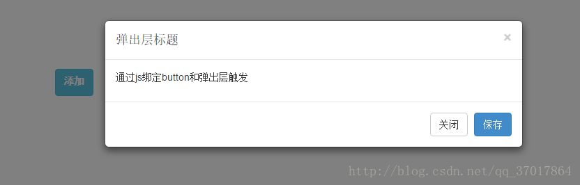
2.方法二:通过js绑定
注意:将button的id和弹出层的id分别赋给 $m_btn和$modal,当$m_btn被点击后$modal弹出。
<button class="btn btn-info" type="button" id="y-modalBtnAdd" > <label >添加</label></button>
<!-- 模态弹出窗内容 -->
<div class="modal" id="y-myModalAdd" tabindex="-1" role="dialog" aria-labelledby="mySmallModalLabel" aria-hidden="true">
<div class="modal-dialog">
<div class="modal-content">
<div class="modal-header">
<button type="button" class="close" data-dismiss="modal">
<span aria-hidden="true">×</span>
<span class="sr-only">Close</span>
</button>
<h5 class="modal-title">弹出层标题</h5>
</div>
<div class="modal-body">
<p>通过js绑定button和弹出层触发</p>
</div>
<div class="modal-footer">
<button type="button" class="btn btn-default" data-dismiss="modal">关闭</button>
<button type="button" class="btn btn-primary">保存</button>
</div>
</div>
</div>
</div>
<!--js代码-->
<script type="text/javascript">
$(function(){
// dom加载完毕
var $m_btn = $('#y-modalBtnAdd'); //y-modalBtnAdd是button的id
var $modal = $('#y-myModalAdd'); //y-myModalAdd是弹出的遮罩层的id,通过这两个id进行绑定
$m_btn.on('click', function(){
$modal.modal({backdrop: 'static'});
});
});
</script>结果:
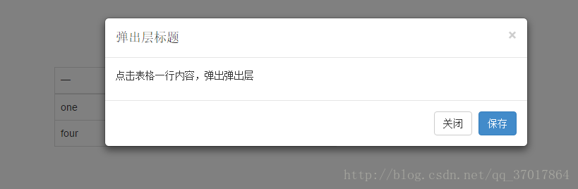
3.方法三:点击表格一行,弹出弹出层
动态给tr标签加弹出的触发属性
<!--表格-->
<table class="table table-bordered " >
<thead>
<tr>
<th>一</th>
<th>二</th>
<th>三</th>
</tr>
</thead>
<tbody class="tableBody">
<tr>
<td>one</td>
<td>two</td>
<td>three</td>
</tr>
<tr>
<td>four</td>
<td>five</td>
<td>six</td>
</tr>
</tbody>
</table>
<!-- 模态弹出窗内容 -->
<div class="modal" id="mymodal-data" tabindex="-1" role="dialog" aria-labelledby="mySmallModalLabel" aria-hidden="true">
<div class="modal-dialog">
<div class="modal-content">
<div class="modal-header">
<button type="button" class="close" data-dismiss="modal">
<span aria-hidden="true">×</span>
<span class="sr-only">Close</span>
</button>
<h5 class="modal-title">弹出层标题</h5>
</div>
<div class="modal-body">
<p>点击表格一行内容,弹出弹出层</p>
</div>
<div class="modal-footer">
<button type="button" class="btn btn-default" data-dismiss="modal">关闭</button>
<button type="button" class="btn btn-primary">保存</button>
</div>
</div>
</div>
</div>
<!--js代码-->
<script type="text/javascript">
$(function () {
$(".tableBody>tr").each(function () {
$(this).on("click",function () {
$(this).attr({"data-toggle":"modal","data-target":"#mymodal-data","data-whatever":"@mdo"});
})
});
});
</script>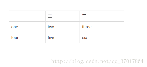
结果:
bootstrap的弹出层在整个屏幕的上半部分,可以将它居中显示。(方法二可以让弹出层居中显示)
$(function(){
    // dom加载完毕
    var $m_btn = $('#y-modalBtnAdd');  y-modalBtnAdd是button的id
    var $modal = $('#y-myModalAdd');  y-myModalAdd是弹出的遮罩层的id,通过这两个id进行绑定
    // 测试 bootstrap 居中  ,bootstrap的弹出层默认是左右居中,上下则是偏上,此代码将弹出层上下也居中了,但是会抖
            动一下
    $modal.on('shown.bs.modal', function(){
      var $this = $(this);
      var $modal_dialog = $this.find('.modal-dialog');
      var m_top = ( $(document).height() - $modal_dialog.height() )/2;
      $modal_dialog.css({'margin': m_top + 'px auto'});
    });
  });
</script>
以上是“BootStrap中如何实现模态框”这篇文章的所有内容,感谢各位的阅读!希望分享的内容对大家有帮助,更多相关知识,欢迎关注亿速云行业资讯频道!
免责声明:本站发布的内容(图片、视频和文字)以原创、转载和分享为主,文章观点不代表本网站立场,如果涉及侵权请联系站长邮箱:is@yisu.com进行举报,并提供相关证据,一经查实,将立刻删除涉嫌侵权内容。


