这篇文章主要讲解了“怎么使用CSS实现中间镂空的图片遮罩效果”,文中的讲解内容简单清晰,易于学习与理解,下面请大家跟着小编的思路慢慢深入,一起来研究和学习“怎么使用CSS实现中间镂空的图片遮罩效果”吧!
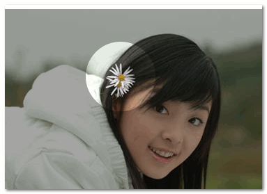
中间镂空的图片遮罩指的大概就是这样一个效果:
镂空一个洞的代码
CSS Code复制内容到剪贴板
<div id="container" style="position: relative; margin: 550px 0 0 50px;">
<svg style="position: absolute;" width="400" height="280">
<defs>
<mask id="mask3">
<rect x="0" y="0" width="100%" height="100%" style="stroke:none; fill: #ccc"></rect>
<circle id="circle1" cx="100" cy="100" r="50" style="fill: #000" />
</mask>
</defs>
<rect x="0" y="0" width="100%" height="100%" style="stroke: none; fill: #ccc; mask: url(#mask3)"></rect>
</svg>
<img src="http://img6.cache.netease.com/cnews/2014/11/3/20141103100737855b7.jpg" />
</div>
镂空多个洞的代码
CSS Code复制内容到剪贴板
<div id="container" style="position: relative;">
<svg style="position: absolute;" width="400" height="280">
<defs>
<mask id="mask3">
<rect x="0" y="0" width="100%" height="100%" style="stroke:none; fill: #ccc"></rect>
<circle id="circle1" cx="100" cy="50" r="50" style="fill: #000" />
<circle id="circle1" cx="300" cy="100" r="50" style="fill: #000" />
<circle id="circle1" cx="100" cy="200" r="50" style="fill: #000" />
</mask>
</defs>
<rect x="0" y="0" width="100%" height="100%" style="stroke: none; fill: #ccc; mask: url(#mask3)"></rect>
</svg>
<img src="http://img6.cache.netease.com/cnews/2014/11/3/20141103100737855b7.jpg" />
</div>
CSS3 版
用 box-shadow ,代码如下:
CSS Code复制内容到剪贴板
position: fixed;
left: 150px;
top: 35px;
width: 100px;
height: 100px;
border-radius: 100px;
box-shadow: rgba(0,0,0,.8) 0px 0px 0px 2005px;
z-index: 100;
缺点是只能镂空一个洞。
感谢各位的阅读,以上就是“怎么使用CSS实现中间镂空的图片遮罩效果”的内容了,经过本文的学习后,相信大家对怎么使用CSS实现中间镂空的图片遮罩效果这一问题有了更深刻的体会,具体使用情况还需要大家实践验证。这里是亿速云,小编将为大家推送更多相关知识点的文章,欢迎关注!
免责声明:本站发布的内容(图片、视频和文字)以原创、转载和分享为主,文章观点不代表本网站立场,如果涉及侵权请联系站长邮箱:is@yisu.com进行举报,并提供相关证据,一经查实,将立刻删除涉嫌侵权内容。


