怎么用CSS3制作页面圆圈加载动画?这个问题可能是我们日常学习或工作经常见到的。希望通过这个问题能让你收获颇深。下面是小编给大家带来的参考内容,让我们一起来看看吧!
制作页面加载动画需要用到很多CSS3中的属性,比如:animation属性,position定位,border-radius圆角,transform属性等等,如有不清楚的同学可以看看我以前的文章,之前都有介绍过,或者访问 CSS3视频教程,这些都是基础,一定要掌握。
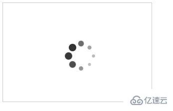
实例:制作一个圆圈加载动画效果,圆圈在加载时大小由小变大,颜色由浅变深,具体代码如下:
HTML部分:
<div class="loader">
      <div class="loading">
          <i></i>
          <i></i>
          <i></i>
          <i></i>
          <i></i>
          <i></i>
          <i></i>
          <i></i>
      </div>
  </div>
CSS部分:
.loader{
       width: 300px;
       border: 1px solid #ccc;
       height: 200px;
       display: flex;
       box-sizing: border-box;
       align-items: center;
       justify-content: center;
   }
   @-webkit-keyframes loading{
       50%{
           transform: scale(0.4);
           opacity: 0.3;
       }
       100%{
           transform: scale(1);
           opacity: 1;
       }
   }
   .loading{
       position: relative;
   }
   .loading i{
       display: block;
       width: 15px;
       height: 15px;
       border-radius: 50%;
       position: absolute;
       background: #333;
   }
   .loading i:nth-child(1){
       top: 25px;
       left: 0;
       -webkit-animation: loading 1s ease 0s infinite;
   }
   .loading i:nth-child(2){
       top: 17px;
       left: 17px;
       -webkit-animation: loading 1s ease 0.12s infinite;
   }
   .loading i:nth-child(3){
       top: 0;
       left: 25px;
       -webkit-animation: loading 1s ease 0.24s infinite;
   }
   .loading i:nth-child(4){
       top: -17px;
       left: 17px;
       -webkit-animation: loading 1s ease 0.36s infinite;
   }
   .loading i:nth-child(5){
       top: -25px;
       left: 0;
       -webkit-animation: loading 1s ease 0.48s infinite;
   }
   .loading i:nth-child(6){
       top: -17px;
       left: -17px;
       -webkit-animation: loading 1s ease 0.6s infinite;
   }
   .loading i:nth-child(7){
       top: 0;
       left: -25px;
       -webkit-animation: loading 1s ease 0.72s infinite;
   }
   .loading i:nth-child(8){
       top: 17px;
       left: -17px;
       -webkit-animation: loading 1s ease 0.84s infinite;
   }
效果图:
感谢各位的阅读!看完上述内容,你们对怎么用CSS3制作页面圆圈加载动画大概了解了吗?希望文章内容对大家有所帮助。如果想了解更多相关文章内容,欢迎关注亿速云行业资讯频道。
免责声明:本站发布的内容(图片、视频和文字)以原创、转载和分享为主,文章观点不代表本网站立场,如果涉及侵权请联系站长邮箱:is@yisu.com进行举报,并提供相关证据,一经查实,将立刻删除涉嫌侵权内容。


