这期内容当中小编将会给大家带来有关怎么在Python中使用Matplotlib实现一个三维数据的散点图,文章内容丰富且以专业的角度为大家分析和叙述,阅读完这篇文章希望大家可以有所收获。
Python是一种跨平台的、具有解释性、编译性、互动性和面向对象的脚本语言,其最初的设计是用于编写自动化脚本,随着版本的不断更新和新功能的添加,常用于用于开发独立的项目和大型项目。
实现过程
其中就有我们需要参考的部分,也就是mplot3d example code : 2dcollections3d_demo.py。下面贴出其中的代码段。
from mpl_toolkits.mplot3d import Axes3D
import numpy as np
import matplotlib.pyplot as plt

fig = plt.figure()
ax = fig.gca(projection='3d')

# Plot a sin curve using the x and y axes.
x = np.linspace(0, 1, 100)
y = np.sin(x * 2 * np.pi) / 2 + 0.5
ax.plot(x, y, zs=0, zdir='z', label='curve in (x,y)')

# Plot scatterplot data (20 2D points per colour) on the x and z axes.
colors = ('r', 'g', 'b', 'k')
x = np.random.sample(20*len(colors))
y = np.random.sample(20*len(colors))
c_list = []
for c in colors:
 c_list.append([c]*20)
# By using zdir='y', the y value of these points is fixed to the zs value 0
# and the (x,y) points are plotted on the x and z axes.
ax.scatter(x, y, zs=0, zdir='y', c=c_list, label='points in (x,z)')

# Make legend, set axes limits and labels
ax.legend()
ax.set_xlim(0, 1)
ax.set_ylim(0, 1)
ax.set_zlim(0, 1)
ax.set_xlabel('X')
ax.set_ylabel('Y')
ax.set_zlabel('Z')

# Customize the view angle so it's easier to see that the scatter points lie
# on the plane y=0
ax.view_init(elev=20., azim=-35)

plt.show()
样例的运行结果大致如下:

首先样例的数据来自于随机数的产生,但是在我实际使用的过程中,数据是需要预先存储与导入的。因此我添加数据导入部分:
import scipy.io as sio
#get the data form F:\matlab.mat
data = sio.loadmat('F:\matlab.mat')
m = data['data']
值得一提的是这只是我测试的数据,在实际应用过程中,数据的格式是多种多样的,所以需要做数据格式转化的模块。同时采用.mat数据的格式,用户可以用matlab打开,并对数据进行更改之类的操作。采用这种方法导入后,会自动形成数组。
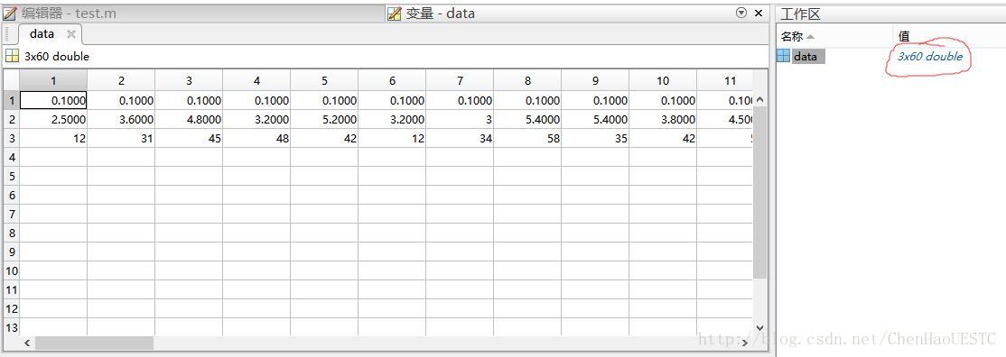
如上图所示,是数据在matlab中打开的形式,因为我们需要画出三维散点图,会自动产生3×60的数组,每行代表每一维的数据。贴一张做出的Demo的成果图:
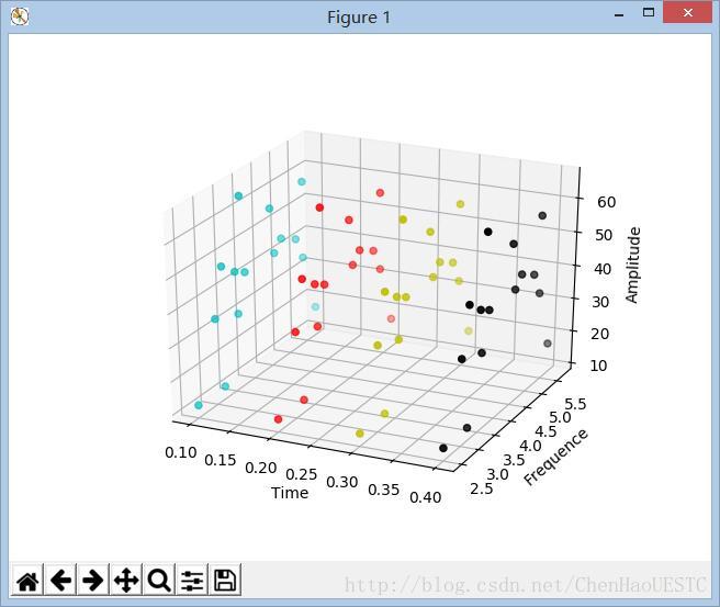
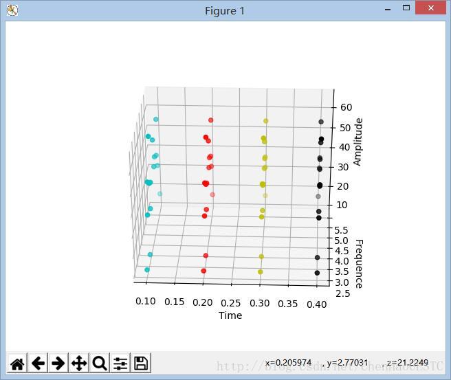
因为我是用Time变量做为Xlabel,同时模拟数据是等时间间距进行采样的,同时想要在不同的时间点采用不同的颜色。因此需要对ax.scatter(x,y,z,c)中的c变量进行更改,可以用变量代替,这样就可以用个循环结构实现颜色的切换功能。
for a in x:
 if a == 0.1:
  C.append('c')
 elif a == 0.2:
  C.append('r')
 elif a == 0.3:
  C.append('y')
 elif a == 0.4:
  C.append('k')
ax.scatter(x, y, z, c=C)
颜色切换部分代码如下:
import scipy.io as sio
from mpl_toolkits.mplot3d import Axes3D
import matplotlib.pyplot as plt
import numpy as np

def Singleplot():
 data = sio.loadmat('F:\matlab.mat')
 m = data['data']

 x = m[0]
 y = m[1]
 z = m[2]

 C = []
 ax = plt.subplot(111, projection='3d')

 for a in x:
 if a == 0.1:
  C.append('c')
 elif a == 0.2:
  C.append('r')
 elif a == 0.3:
  C.append('y')
 elif a == 0.4:
  C.append('k')

 ax.scatter(x, y, z, c=C)

 ax.set_xlabel('Time')
 ax.set_ylabel('Frequence')
 ax.set_zlabel('Amplitude')

 plt.show()

singleplot()
上述就是小编为大家分享的怎么在Python中使用Matplotlib实现一个三维数据的散点图了,如果刚好有类似的疑惑,不妨参照上述分析进行理解。如果想知道更多相关知识,欢迎关注亿速云行业资讯频道。
免责声明:本站发布的内容(图片、视频和文字)以原创、转载和分享为主,文章观点不代表本网站立场,如果涉及侵权请联系站长邮箱:is@yisu.com进行举报,并提供相关证据,一经查实,将立刻删除涉嫌侵权内容。


