本文实例为大家分享了Android设置控件阴影的方法,供大家参考,具体内容如下
第一种方式:elevation
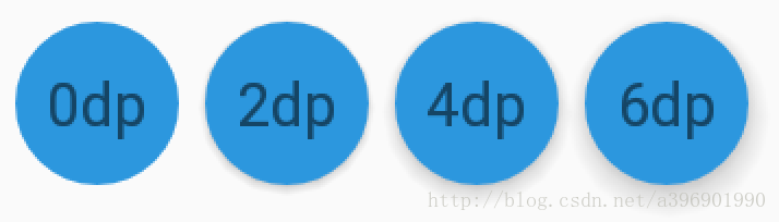
View的大小位置都是通过x,y确定的,而现在有了z轴的概念,而这个z值就是View的高度(elevation),而高度决定了阴影(shadow)的大小。
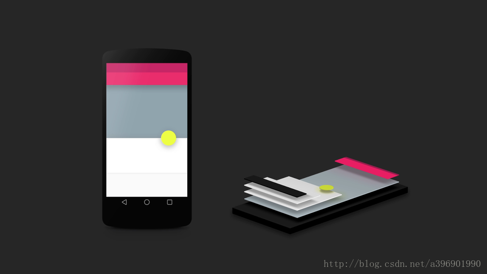
View Elevation(视图高度)
View的z值由两部分组成,elevation和translationZ(它们都是Android L新引入的属性)。
eleavation是静态的成员,translationZ是用来做动画。
Z = elevation + translationZ
在layout中使用* android:elevation*属性去定义
在代码中使用 View.setElevation 方法去定义
设置视图的translation,可以使用View.setTranslationZ方法
新的ViewPropertyAnimator.z和ViewPropertyAnimator.translationZ方法可以设置视图的elevation值
我们通过设置elevation的值也会达到卡片阴影效果
第二种方式:CardView
今天有空学习了下CardView的使用,既然是使用,不凡使用一个实例操作一下
CardView是Android5.0的新控件,所以我们需要在dependencies中添加支持:
compile 'com.android.support:cardview-v7:26.0.0'
CardView是继承FrameLayout的一个布局控件,从源码可以看出CardView支持的属性有:
card_view:cardElevation 阴影的大小
card_view:cardMaxElevation 阴影最大高度
card_view:cardBackgroundColor 卡片的背景色
card_view:cardCornerRadius 卡片的圆角大小
card_view:contentPadding 卡片内容于边距的间隔
card_view:contentPaddingBottom
card_view:contentPaddingTop
card_view:contentPaddingLeft
card_view:contentPaddingRight
card_view:contentPaddingStart
card_view:contentPaddingEnd
card_view:cardUseCompatPadding 设置内边距,V21+的版本和之前的版本仍旧具有一样的计算方式
card_view:cardPreventConrerOverlap 在V20和之前的版本中添加内边距,这个属性为了防止内容和边角的重叠
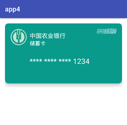
我们看一下今天要实现的效果图:
有兴趣的朋友可以尝试使用ViewPager+CardView实现卡片画廊的效果
其实CardView的使用相当于加了一个布局使用,其CardView里面内容的实现,还是在布局中设计
银行卡布局:
<?xml version="1.0" encoding="utf-8"?>
<RelativeLayout xmlns:android="http://schemas.android.com/apk/res/android"
  android:layout_width="match_parent"
  android:layout_height="match_parent"
  android:background="#ffffff"
  android:padding="16dp">

  <android.support.v7.widget.CardView
    xmlns:app="http://schemas.android.com/apk/res-auto"
    android:layout_width="match_parent"
    android:layout_height="180dp"
    app:cardBackgroundColor="#099A8C"
    app:cardCornerRadius="10dp"
    app:cardElevation="10dp"
    app:contentPadding="16dp">

    <LinearLayout
      android:layout_width="match_parent"
      android:layout_height="match_parent"
      android:orientation="horizontal">

      <ImageView
        android:layout_width="50dp"
        android:layout_height="50dp"
        android:background="@drawable/icon_01" />

      <LinearLayout
        android:layout_width="match_parent"
        android:layout_height="match_parent"
        android:layout_weight="1"
        android:orientation="vertical"
        android:padding="8dp">

        <TextView
          android:layout_width="wrap_content"
          android:layout_height="wrap_content"
          android:text="中国农业银行"
          android:textColor="#ffffff"
          android:textSize="18sp" />

        <TextView
          android:layout_width="wrap_content"
          android:layout_height="wrap_content"
          android:text="储蓄卡"
          android:textColor="#ffffff"
          android:textSize="16sp" />
        <TextView
          android:layout_width="match_parent"
          android:layout_height="match_parent"
          android:textColor="#ffffff"
          android:gravity="center_vertical"
          android:textSize="22sp"
          android:text="**** **** **** 1234"/>
      </LinearLayout>

      <ImageView
        android:layout_width="60dp"
        android:layout_height="15dp"
        android:background="@drawable/icon_02" />
    </LinearLayout>
  </android.support.v7.widget.CardView>

</RelativeLayout>
特别注意的是:使用CardView的属性时,记得加上命名空间的声明
xmlns:app="http://schemas.android.com/apk/res-auto
第三种方式:最强按钮通过Color来进行设置
自认为这是按钮最好看的效果,还自带按下效果,设置也非常简单,秒杀一切阴影效果,我们先来看下他的效果
未按下效果
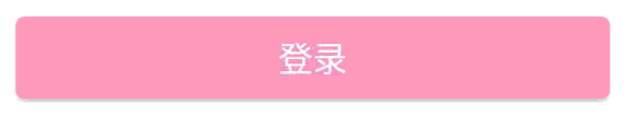
按下效果
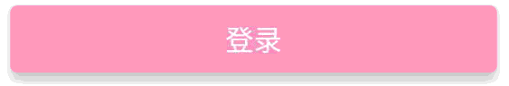
**其实这种效果非常简单,就是定义了一个颜色。对就是一个颜色就可以达到这种效果
那这个颜色要怎么定义才能达到这种效果呢**
比如上图的按钮颜色是粉红色,颜色代码 #f692bf,我们只需要在前面加上#ff,最后这样#ff692bf 就可以达到这种效果。
以上就是本文的全部内容,希望对大家的学习有所帮助,也希望大家多多支持亿速云。
免责声明:本站发布的内容(图片、视频和文字)以原创、转载和分享为主,文章观点不代表本网站立场,如果涉及侵权请联系站长邮箱:is@yisu.com进行举报,并提供相关证据,一经查实,将立刻删除涉嫌侵权内容。


