本篇内容介绍了“CSS3实现动画按钮代码分享”的有关知识,在实际案例的操作过程中,不少人都会遇到这样的困境,接下来就让小编带领大家学习一下如何处理这些情况吧!希望大家仔细阅读,能够学有所成!
今天来分享很不错的CSS3按钮动画,这款CSS3按钮一共有5种动画方式,每一种都是鼠标滑过动画形式,虽然这些动画按钮不是十分华丽,但是小编觉得不像其他按钮那样很难扩展,我们可以修改CSS代码随意改变自己喜欢的颜色样式。
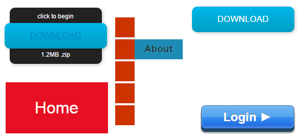
让我们一起来看看实现这5中样式动画按钮的HTML代码和CSS代码吧。以第一个按钮为例,其他按钮的代码大家可以下载源代码来研究,并不是很难。
HTML代码:
XML/HTML Code复制内容到剪贴板
<div class="button01">
<a href="#">Download</a>
<p class="top">click to begin</p>
<p class="bottom">1.2MB .zip</p>
</div>
CSS代码:
CSS Code复制内容到剪贴板
.button01 {
width: 200px;
margin: 50px auto 20px auto;
}
.button01 a {
display: block;
height: 50px;
width: 200px;
/*TYPE*/
color: white;
font: 17px/50px Helvetica, Verdana, sans-serif;
text-decoration: none;
text-align: center;
text-transform: uppercase;
/*GRADIENT*/
background: #00b7ea; /* Old browsers */
background: -moz-linear-gradient(top, #00b7ea 0%, #009ec3 100%); /* FF3.6+ */
background: -webkit-gradient(linear, left top, left bottombottom, color-stop(0%,#00b7ea), color-stop(100%,#009ec3)); /* Chrome,Safari4+ */
background: -webkit-linear-gradient(top, #00b7ea 0%,#009ec3 100%); /* Chrome10+,Safari5.1+ */
background: -o-linear-gradient(top, #00b7ea 0%,#009ec3 100%); /* Opera 11.10+ */
background: -ms-linear-gradient(top, #00b7ea 0%,#009ec3 100%); /* IE10+ */
background: linear-gradient(top, #00b7ea 0%,#009ec3 100%); /* W3C */
filter: progid:DXImageTransform.Microsoft.gradient( startColorstr='#00b7ea', endColorstr='#009ec3',GradientType=0 ); /* IE6-9 */
}
.button01 a, p {
-webkit-border-radius: 10px;
-moz-border-radius: 10px;
border-radius: 10px;
-webkit-box-shadow: 2px 2px 8px rgba(0,0,0,0.2);
-moz-box-shadow: 2px 2px 8px rgba(0,0,0,0.2);
box-shadow: 2px 2px 8px rgba(0,0,0,0.2);
}
p {
background: #222;
display: block;
height: 40px;
width: 180px;
margin: -50px 0 0 10px;
/*TYPE*/
text-align: center;
font: 12px/45px Helvetica, Verdana, sans-serif;
color: #fff;
/*POSITION*/
position: absolute;
z-index: -1;
/*TRANSITION*/
-webkit-transition: margin 0.5s ease;
-moz-transition: margin 0.5s ease;
-o-transition: margin 0.5s ease;
-ms-transition: margin 0.5s ease;
transition: margin 0.5s ease;
}
/*HOVER*/
.button01:hover .bottombottom {
margin: -10px 0 0 10px;
}
.button01:hover .top {
margin: -80px 0 0 10px;
line-height: 35px;
}
/*ACTIVE*/
.button01 a:active {
background: #00b7ea; /* Old browsers */
background: -moz-linear-gradient(top, #00b7ea 36%, #009ec3 100%); /* FF3.6+ */
background: -webkit-gradient(linear, left top, left bottombottom, color-stop(36%,#00b7ea), color-stop(100%,#009ec3)); /* Chrome,Safari4+ */
background: -webkit-linear-gradient(top, #00b7ea 36%,#009ec3 100%); /* Chrome10+,Safari5.1+ */
background: -o-linear-gradient(top, #00b7ea 36%,#009ec3 100%); /* Opera 11.10+ */
background: -ms-linear-gradient(top, #00b7ea 36%,#009ec3 100%); /* IE10+ */
background: linear-gradient(top, #00b7ea 36%,#009ec3 100%); /* W3C */
filter: progid:DXImageTransform.Microsoft.gradient( startColorstr='#00b7ea', endColorstr='#009ec3',GradientType=0 ); /* IE6-9 */
}
.button01:active .bottombottom {
margin: -20px 0 0 10px;
}
.button01:active .top {
margin: -70px 0 0 10px;
}
“CSS3实现动画按钮代码分享”的内容就介绍到这里了,感谢大家的阅读。如果想了解更多行业相关的知识可以关注亿速云网站,小编将为大家输出更多高质量的实用文章!
免责声明:本站发布的内容(图片、视频和文字)以原创、转载和分享为主,文章观点不代表本网站立场,如果涉及侵权请联系站长邮箱:is@yisu.com进行举报,并提供相关证据,一经查实,将立刻删除涉嫌侵权内容。


