本篇内容介绍了“如何实现Echats图表大屏自适应”的有关知识,在实际案例的操作过程中,不少人都会遇到这样的困境,接下来就让小编带领大家学习一下如何处理这些情况吧!希望大家仔细阅读,能够学有所成!
1.准备一个容器组件,width = 100vw,height = 100%,作为大屏展示的背景:
 <div class="screen-adapter">
 </div>

 .screen-adapter {
  width: 100vw;
  min-height: 100%;
  max-height: 100vh;
  overflow: hidden;
  background: #0c1a3c;
}
2.根据设计同学提供的设计图可以计算出每部分区域的百分比,例如总尺寸是w*h,其中一个图标宽高是w1 * h2,实现常规切图,此时由1-->2可得:
<div class="screen-adapter">
    <div class="content-wrap" :>
      <slot></slot>
    </div>
</div>
props: {
    w: { // 设计图尺寸宽
      type: Number,
      default: 1600
    },
    h: { // 设计图尺寸高
      type: Number,
      default: 900
    }
},
data () {
    return {
      style: {
        width: this.w + 'px',
        height: this.h + 'px',
        transform: 'scale(1) translate(-50%, -50%)' // 默认不缩放,垂直水平居中
      }
    }
}

.content-wrap {
  transform-origin: 0 0;
  position: absolute;
  top: 50%;
  left: 50%;
}
3.基于第二步,需要根据大屏具体尺寸计算缩放比例,以及设置缩放比例,需要注意的是,绑定resize事件一定别忘了防抖,页面销毁别忘了移除监听事件:
mounted () {
    this.setScale()
    this.onresize = this.debounce(() => this.setScale(), 100)
    window.addEventListener('resize', this.onresize)
},
beforeDestroy () {
    window.removeEventListener('resize', this.onresize)
},
 methods: {
    // 防抖
    debounce (fn, t) {
      const delay = t || 500
      let timer
      return function () {
        const args = arguments
        if (timer) {
          clearTimeout(timer)
        }
        const context = this
        timer = setTimeout(() => {
          timer = null
          fn.apply(context, args)
        }, delay)
      }
    },
    // 获取缩放比例
    getScale () {
      const w = window.innerWidth / this.w
      const h = window.innerHeight / this.h
      return w < h ? w : h
    },
    // 设置缩放比例
    setScale () {
      this.style.transform = `scale(${this.getScale()}) translate(-50%, -50%)`
    }
  }
4.至此,大概结构已经得到,只需要将各部分图标组件还原的设计图放入之前的 插槽即可,各部分图标组件的尺寸按照设计提供的百分比即可,所有代码大致如下:
// ScreenAdapter.vue
<template>
  <div class="screen-adapter">
    <div class="content-wrap" :>
      <slot></slot>
    </div>
  </div>
</template>
<script>
export default {
  props: {
    w: {
      type: Number,
      default: 1600
    },
    h: {
      type: Number,
      default: 900
    }
  },
  data () {
    return {
      style: {
        width: this.w + 'px',
        height: this.h + 'px',
        transform: 'scale(1) translate(-50%, -50%)'
      }
    }
  },
  mounted () {
    this.setScale()
    this.onresize = this.Debounce(() => this.setScale(), 100)
    window.addEventListener('resize', this.onresize)
  },
  beforeDestroy () {
    window.removeEventListener('resize', this.onresize)
  },
  methods: {
    Debounce (fn, t) {
      const delay = t || 500
      let timer
      return function () {
        const args = arguments
        if (timer) {
          clearTimeout(timer)
        }
        const context = this
        timer = setTimeout(() => {
          timer = null
          fn.apply(context, args)
        }, delay)
      }
    },
    getScale () {
      const w = window.innerWidth / this.w
      const h = window.innerHeight / this.h
      return w < h ? w : h
    },
    setScale () {
      this.style.transform = `scale(${this.getScale()}) translate(-50%, -50%)`
    }
  }
}
</script>
<style>
.screen-adapter {
  width: 100%;
  min-height: 100vh;
  max-height: 100vh;
  overflow: hidden;
  background: #0c1a3c;
}
.content-wrap {
  transform-origin: 0 0;
  position: absolute;
  top: 50%;
  left: 50%;
}
</style>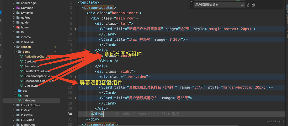

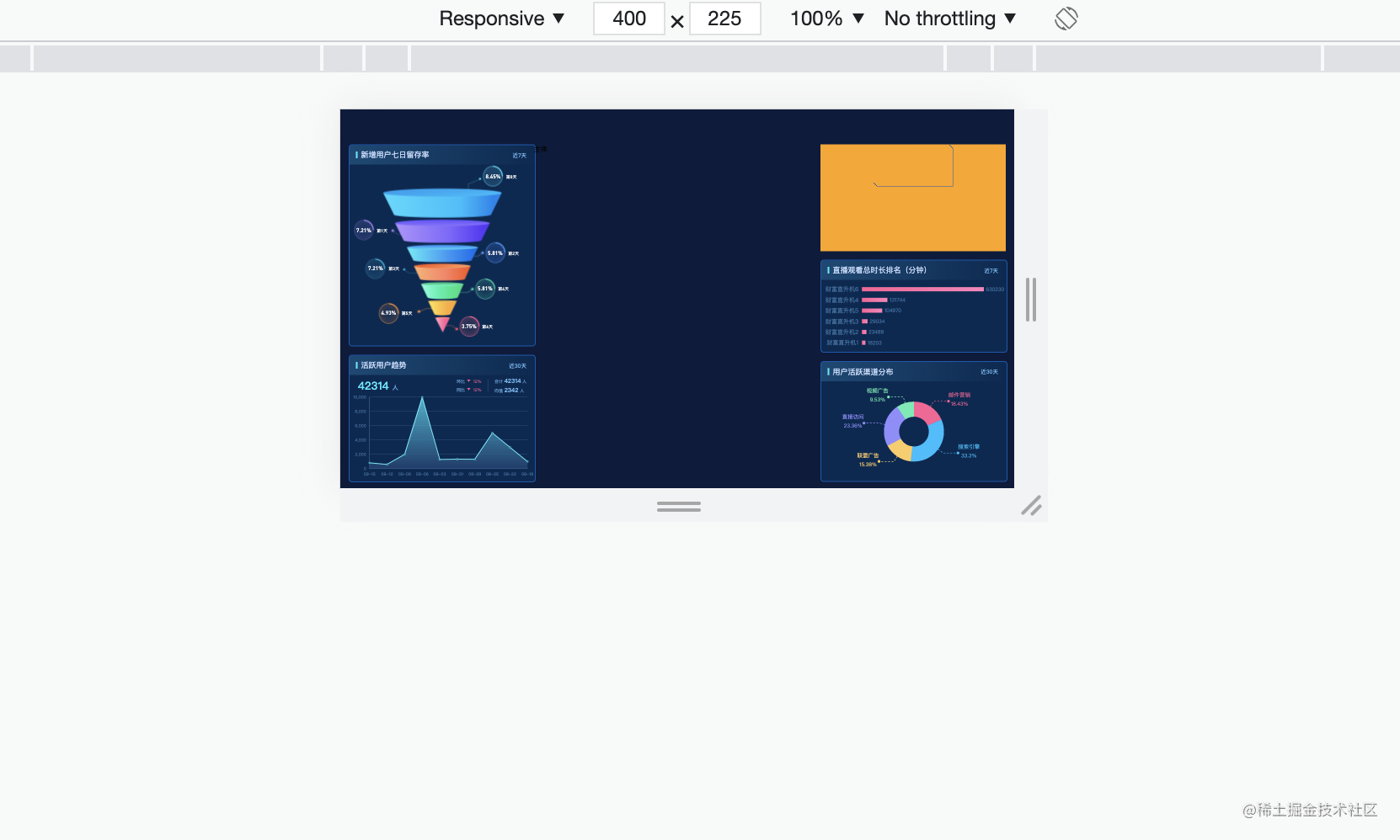
可以看出,字体图表都是等比例缩放的
“如何实现Echats图表大屏自适应”的内容就介绍到这里了,感谢大家的阅读。如果想了解更多行业相关的知识可以关注亿速云网站,小编将为大家输出更多高质量的实用文章!
免责声明:本站发布的内容(图片、视频和文字)以原创、转载和分享为主,文章观点不代表本网站立场,如果涉及侵权请联系站长邮箱:is@yisu.com进行举报,并提供相关证据,一经查实,将立刻删除涉嫌侵权内容。


