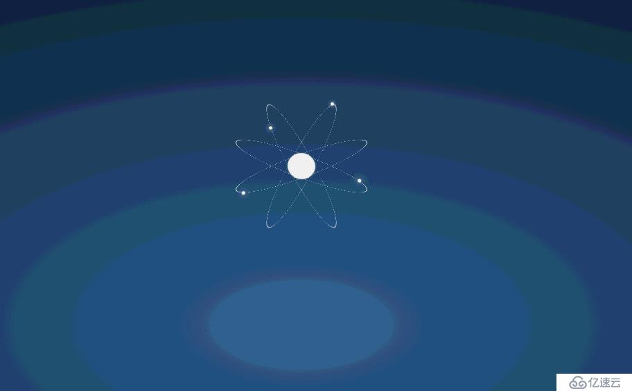
这篇文章主要介绍“怎么用CSS3制作环形星星发光动画”,在日常操作中,相信很多人在怎么用CSS3制作环形星星发光动画问题上存在疑惑,小编查阅了各式资料,整理出简单好用的操作方法,希望对大家解答”怎么用CSS3制作环形星星发光动画”的疑惑有所帮助!接下来,请跟着小编一起来学习吧!
html源码:
    <div><div></div></div>
    <div><div></div></div>
    <div><div></div></div>
    <div><div></div></div>
css源码:
   <style type="text/css">
        *{margin:0;padding:0;}
        html,body{
            height:100%;
        }
        body{
            background:radial-gradient(ellipse at center,#34679a 0%, #214163 50%, #0d1926 100%);/*径向渐变   椭圆*/
        }
        body > div{
            width:200px;/*宽度 px像素  cm*/
            height:200px;/*高度*/
            border:1px #fff solid;/*边框 宽度 风格 颜色*/
            border-radius:50%;/*圆角*/
            position:absolute;
            top:15%;
            left:50%;
            margin-left:-101px;
            transform:rotateX(80deg) rotateY(20deg);
            transform-style:preserve-3d;
        }
        body > div:nth-of-type(2){
            transform:rotateX(-80deg) rotateY(20deg);
        }
        body > div:nth-of-type(3){
            transform:rotateX(-70deg) rotateY(60deg);
        }
        body > div:nth-of-type(4){
            transform:rotateX(70deg) rotateY(60deg);
        }
        body > div:first-of-type:after{
            width:40px;
            height:40px;
            content:"";
            background:#fff;
            position:absolute;
            top:50%;
            left:50%;
            margin-top:-20px;
            margin-left:-20px;
            transform:rotateX(80deg);
            border-radius:50%;
            animation:nucleus 2s infinite linear;
        }
        body > div > div{
            width:200px;
            height:200px;
            position:relative;
            transform-style:preserve-3d;
            animation:trail 1s infinite linear; /*自定义动画  动画名称 时间 播放次数 速度*/
        }
        body > div > div:after{
            content:"";
            width:5px;
            height:5px;
            background:#fff;
            position:absolute;
            top:-5px;
            left:50%;
            margin-left:-5px;
            border-radius:50%;
            box-shadow:0 0 12px #fff;/*阴影 x y 模糊度 颜色*/
            animation:particle 1s infinite linear;
        }
        /*自定义动画执行*/
        @keyframes trail{
            from{
                transform:rotateZ(0deg);
            }
            to{
                transform:rotateZ(360deg);
            }
        }
        @keyframes particle{
            from{
                transform:rotateX(90deg) rotateY(0deg);
            }
            to{
                transform:rotateX(90deg) rotateY(-360deg);
            }
        }
        @keyframes nucleus{
            0%{
                box-shadow:0 0 0 transparent;
            }
            50%{
                box-shadow:0 0 25px #fff;
            }
            100%{
                box-shadow:0 0 0 transparent;
            }
        }
        body > div:nth-of-type(2) > div,
        body > div:nth-of-type(2) > div:after{
            animation-delay:-0.5s;
        }
        body > div:nth-of-type(3) > div,
        body > div:nth-of-type(3) > div:after{
            animation-delay:-1s;
        }
        body > div:nth-of-type(4) > div,
        body > div:nth-of-type(4) > div:after{
            animation-delay:-1.5s;
        }

   </style>
到此,关于“怎么用CSS3制作环形星星发光动画”的学习就结束了,希望能够解决大家的疑惑。理论与实践的搭配能更好的帮助大家学习,快去试试吧!若想继续学习更多相关知识,请继续关注亿速云网站,小编会继续努力为大家带来更多实用的文章!
免责声明:本站发布的内容(图片、视频和文字)以原创、转载和分享为主,文章观点不代表本网站立场,如果涉及侵权请联系站长邮箱:is@yisu.com进行举报,并提供相关证据,一经查实,将立刻删除涉嫌侵权内容。


