这篇文章给大家分享的是有关web开发中如何实现响应式布局的内容。小编觉得挺实用的,因此分享给大家做个参考,一起跟随小编过来看看吧。
响应式布局
响应式布局在面对不同分辨率设备灵活性强,在平时的网页设计中基本上都要用到响应式布局设计,它给我们提供了良好的用户浏览页面,能带给我们更好的客户体验,下面给大家分享下我做的一个简单的响应式的布局:
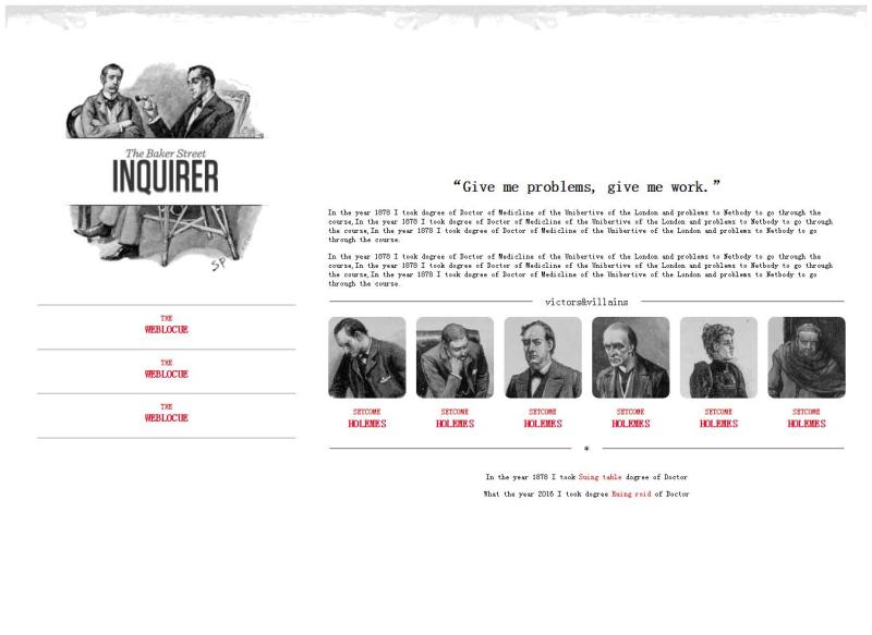
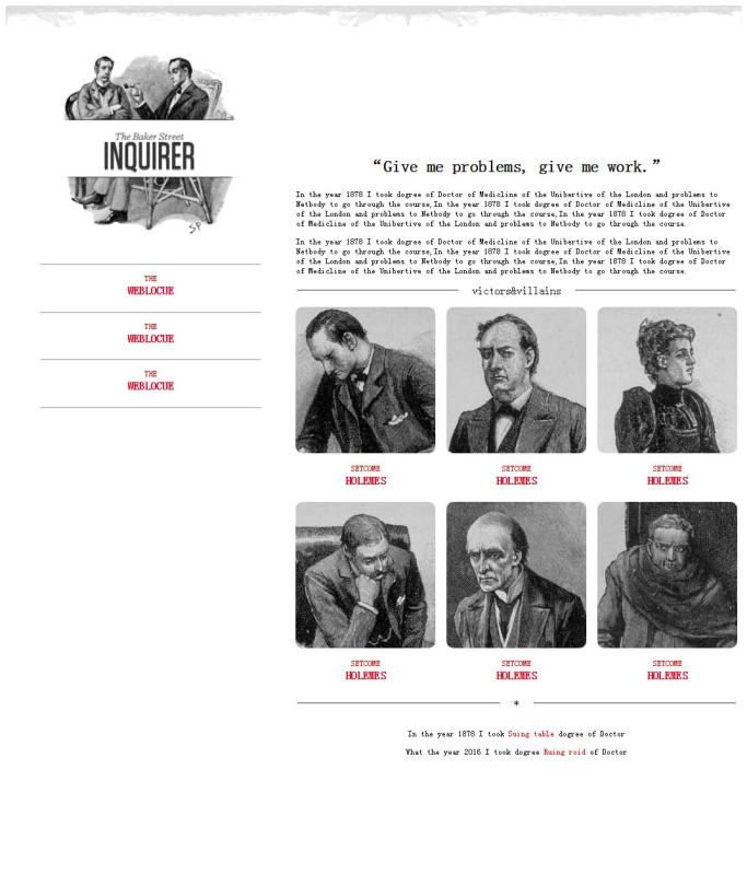
不同的页面会适用不同大小浏览器页面,它会随着分辨率的变化而变化。代码展示如下:
<!DOCTYPE html>
<html>
<head>
<meta charset="utf-8" />
<title></title>
<style>
  p{
    font-size: 12px;
  }
  header{
    width: 100%;
  }
  header img{
    width: 100%;
  }
  @media (min-width: 1300px) and (max-width:1400px) {
    #left{
      float: left;
      width: 30%;
      margin: 0px 50px;
    }
    #left #logo-bg{
      margin: 10% 10%;
      width: 80%;
      position: relative;
    }
    #left #logo{
      float: left;
      width: 12%;
      position: absolute;
      left: 13%;
      top: 230px;
    }
    #left p{
      margin-bottom: -20px;
    }
    #left p,h5{
      text-align: center;
      color: red;
    }
    #right{
      float: left;
      width: 60%;
      margin: 15% 0px;
    }
    #right h3{
      text-align: center;
    }
    #right fieldset{
      text-align: center;
      border-left: none;
      border-right: none;
      border-bottom: none;
    }
    #right fieldset legend{
      padding: 0px 20px;
    }
    #fen{
      width: 100%;
      -webkit-column-count: 6;
      -moz-column-count: 6;
      -o-column-count: 6;
      -ms-column-count: 6;
      column-count: 6;
      -webkit-column-gap: 1em;
      -moz-column-gap: 1em;
      -o-column-gap: 1em;
      -ms-column-gap: 1em;
      column-gap: 1em;
    }
    #fen img{
      width: 100%;
      border-radius: 10px 10px 10px 10px;
    }
    #fen p,h5{
      text-align: center;
      color: red;
    }
    #fen p{
      margin-bottom: -20px;
    }
    #di p{
      text-align: center;
    }
    #di p span{
       color: red;
    }
  }
  @media (min-width: 1000px) and (max-width:1300px){
    #left{
      float: left;
      width: 30%;
      margin: 0px 50px;
    }
    #left #logo-bg{
      margin: 10% 10%;
      width: 80%;
      position: relative;
    }
    #left #logo{
      width: 12%;
      position: absolute;
      left: 14%;
      top: 190px;
    }
    #left p{
      margin-bottom: -20px;
    }
    #left p,h5{
      text-align: center;
      color: red;
    }
    #right{
      float: left;
      width: 60%;
      margin: 15% 0px;
    }
    #right h3{
      text-align: center;
    }
    #right fieldset{
      text-align: center;
      border-left: none;
      border-right: none;
      border-bottom: none;
    }
    #right fieldset legend{
      padding: 0px 20px;
    }
    #fen{
      width: 100%;
      -webkit-column-count: 3;
      -moz-column-count: 3;
      -o-column-count: 3;
      -ms-column-count: 3;
      column-count: 3;
      -webkit-column-gap: 1em;
      -moz-column-gap: 1em;
      -o-column-gap: 1em;
      -ms-column-gap: 1em;
      column-gap: 1em;
    }
    #fen img{
        width: 100%;
        border-radius: 10px 10px 10px 10px;
    }
    #fen p,h5{
        text-align: center;
        color: red;
      }
    #fen p{
        margin-bottom: -20px;
    }
    #di p{
      text-align: center;
    }
    #di p span{
      color: red;
    }
  }
</style>
</head>
<body>
  <header>
    <img src="img/rag.png" />
  </header>
  <aside id="left">
    <img src="img/logo-bg.png" id="logo-bg"/>
    <img src="img/logo.png" id="logo" />
    <hr />
    <p>THE</p>
    <h5>WEBLOCUE</h5>
    <hr />
    <p>THE</p>
    <h5>WEBLOCUE</h5>
    <hr />
    <p>THE</p>
    <h5>WEBLOCUE</h5>
    <hr />
  </aside>
  <article id="right">
    <h3>“Give me problems, give me work.”</h3>
    <p>In the year 1878 I took dogree of Doctor of Medicline of the Unibertive of the London and problems to Netbody to go through the course,In the year 1878 I took dogree of Doctor of Medicline of the Unibertive of the London and problems to Netbody to go through the course,In the year 1878 I took dogree of Doctor of Medicline of the Unibertive of the London and problems to Netbody to go through the course.</p>
    <p>In the year 1878 I took dogree of Doctor of Medicline of the Unibertive of the London and problems to Netbody to go through the course,In the year 1878 I took dogree of Doctor of Medicline of the Unibertive of the London and problems to Netbody to go through the course,In the year 1878 I took dogree of Doctor of Medicline of the Unibertive of the London and problems to Netbody to go through the course.</p>
    <fieldset><legend>victors</legend></fieldset>
    <div id="fen">
      <img src="img/1.jpg" />
      <p>SETCOME</p>
      <h5>HOLEMES</h5>
      <img src="img/2.jpg" />
      <p>SETCOME</p>
      <h5>HOLEMES</h5>
      <img src="img/3.jpg" />
      <p>SETCOME</p>
      <h5>HOLEMES</h5>
      <img src="img/4.jpg" />
      <p>SETCOME</p>
      <h5>HOLEMES</h5>
      <img src="img/5.jpg" />
      <p>SETCOME</p>
      <h5>HOLEMES</h5>
      <img src="img/6.jpg" />
      <p>SETCOME</p>
      <h5>HOLEMES</h5>
    </div>
    <fieldset><legend>*</legend></fieldset>
    <div id="di">
      <p>In the year 1878 I took <span>Suing table</span> dogree of Doctor</p>
      <p>What the year 2016 I took dogree <span>Ruing roid</span> of Doctor</p>
    </div>
  </article>
</body>
</html>
感谢各位的阅读!关于“web开发中如何实现响应式布局”这篇文章就分享到这里了,希望以上内容可以对大家有一定的帮助,让大家可以学到更多知识,如果觉得文章不错,可以把它分享出去让更多的人看到吧!
免责声明:本站发布的内容(图片、视频和文字)以原创、转载和分享为主,文章观点不代表本网站立场,如果涉及侵权请联系站长邮箱:is@yisu.com进行举报,并提供相关证据,一经查实,将立刻删除涉嫌侵权内容。


