本篇内容介绍了“怎么用纯CSS3画出小黄人图案”的有关知识,在实际案例的操作过程中,不少人都会遇到这样的困境,接下来就让小编带领大家学习一下如何处理这些情况吧!希望大家仔细阅读,能够学有所成!
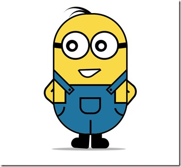
效果就像这样:
不废话,直接上代码!
hrml代码:
XML/HTML Code复制内容到剪贴板
<!DOCTYPE html>
<html>
<head lang="zh">
<meta charset="UTF-8">
<title>纯CSS3画出小黄人并实现动画效果</title>
<Link href="index.css" type="text/css" rel="stylesheet" />
</head>
<body>
<!--容器-->
<div class="wrapper">
<!--小黄人-->
<div class="container">
<!--头发-->
<div class="hairs">
<div class="hairs_one"></div>
<div class="hairs_two"></div>
</div>
<!--头发-->
<!--眼睛-->
<div class="eyes">
<div class="eye_left">
<div class="black">
<div class="white"></div>
</div>
</div>
<div class="eye_right">
<div class="black">
<div class="white"></div>
</div>
</div>
</div>
<!--眼睛-->
<!--嘴巴-->
<div class="mouth">
<div class="mouth_box"></div>
</div>
<!--嘴巴-->
<!--手-->
<div class="hands">
<div class="left_hand"></div>
<div class="right_hand"></div>
</div>
<!--手-->
<!--身体-->
<div class="mybody">
<!--裤子-->
<div class="trousers">
<!--裤子突出部分-->
<div class="trousers_top"></div>
<!--裤子口袋-->
<div class="pocket"></div>
<!--三角线-->
<div class="line-left"></div>
<div class="line-right"></div>
<div class="line-bottom"></div>
<!--吊带-->
<div class="condoleBelt">
<div class="left"></div>
<div class="right"></div>
</div>
</div>
<!--裤子-->
</div>
<!--身体-->
<!--脚-->
<div class="foot">
<div class="left_foot"></div>
<div class="right_foot"></div>
</div>
<!--脚-->
<!--阴影-->
<div class="foot_shadow"></div>
<!--阴影-->
</div>
</div>
</body>
</html>
css代码:
CSS Code复制内容到剪贴板
body {
margin: 0;
padding: 0;
}
.wrapper {
width: 300px;
margin: 100px auto;
}
.container {
position: relative;
}
.container .mybody {
position: absolute;
width: 240px;
height: 400px;
border: 5px solid #000;
border-radius: 115px;
background: #f9d946;
overflow: hidden;
z-index: 2;
}
.container .mybody .trousers {
position: absolute;
bottombottom: 0;
width: 100%;
height: 100px;
border-top: 6px solid #000;
background: #2074a0;
}
.container .mybody .trousers .trousers_top {
width: 160px;
height: 60px;
background: #2074a0;
position: absolute;
bottombottom: 100px;
left: 0;
rightright: 0;
margin: 0 auto;
border: 6px solid #000;
border-bottom: none;
}
.container .mybody .trousers .pocket {
width: 60px;
height: 45px;
border: 6px solid #000;
border-radius: 0 0 25px 25px;
left: 0;
rightright: 0;
margin: 0 auto;
position: absolute;
bottombottom: 65px;
}
.container .mybody .trousers .line-left,
.container .mybody .trousers .line-rightright {
width: 30px;
height: 30px;
border-bottom-rightright-radius: 100px;
border-right: 6px solid;
border-bottom: 6px solid;
position: absolute;
top: 10px;
}
.container .mybody .trousers .line-rightright {
rightright: 0;
-webkit-transform: rotate(75deg);
-moz-transform: rotate(75deg);
-o-transform: rotate(75deg);
transform: rotate(75deg);
-ms-transform: rotate(75deg);
}
.container .mybody .trousers .line-bottombottom {
height: 40px;
border: 3px solid #000;
left: 118px;
position: absolute;
bottombottom: 0;
border-radius: 3px;
}
.container .mybody .trousers .condoleBelt {
position: absolute;
}
.container .mybody .trousers .condoleBelt .left,
.container .mybody .trousers .condoleBelt .rightright {
width: 100px;
height: 16px;
border: 5px solid #000;
background: #2074a0;
top: -90px;
position: absolute;
}
.container .mybody .trousers .condoleBelt .left:after,
.container .mybody .trousers .condoleBelt .rightright:after {
content: '';
background: #000;
width: 8px;
height: 8px;
border-radius: 50%;
position: absolute;
top: 3px;
}
.container .mybody .trousers .condoleBelt .left {
left: -35px;
transform: rotate(45deg);
}
.container .mybody .trousers .condoleBelt .left:after {
rightright: 3px;
}
.container .mybody .trousers .condoleBelt .rightright {
transform: rotate(-45deg);
left: 165px;
}
.container .mybody .trousers .condoleBelt .rightright:after {
left: 3px;
}
.container .hairs {
position: relative;
}
.container .hairs .hairs_one {
width: 130px;
height: 100px;
border-top: 8px solid #000;
position: absolute;
transform: rotate(35deg);
left: 24px;
top: -17px;
border-radius: 50%;
animation: hairs 2s ease-in-out infinite;
}
.container .hairs .hairs_two {
width: 80px;
height: 80px;
border-top: 6px solid #000;
position: absolute;
transform: rotate(15deg);
left: 50px;
top: -10px;
border-radius: 50%;
}
.container .eyes {
position: relative;
z-index: 3;
}
.container .eyes .eye_left,
.container .eyes .eye_right {
width: 85px;
height: 85px;
border: 6px solid #000;
border-radius: 50%;
background: #fff;
position: absolute;
top: 60px;
}
.container .eyes .eye_left:after,
.container .eyes .eye_right:after {
content: '';
width: 28px;
height: 18px;
background: #000;
position: absolute;
top: 40%;
}
.container .eyes .eye_left {
left: 27px;
}
.container .eyes .eye_left:after {
left: -30px;
transform: rotate(7deg) skewX(20deg);
}
.container .eyes .eye_right {
left: 124px;
}
.container .eyes .eye_right:after {
rightright: -32px;
transform: rotate(-7deg) skewX(-20deg);
}
.container .eyes .black {
width: 40px;
height: 40px;
background: #000;
border-radius: 50%;
position: absolute;
top: 24px;
left: 22px;
animation: eys_black 5s ease-in-out infinite;
}
.container .eyes .white {
width: 20px;
height: 20px;
background: #fff;
border-radius: 50%;
position: absolute;
top: 10px;
left: 10px;
animation: eys_white 5s ease-in-out infinite;
}
.container .mouth {
position: relative;
z-index: 3;
}
.container .mouth .mouth_box {
position: absolute;
width: 55px;
height: 35px;
border: 5px solid #000;
background: #fff;
top: 170px;
left: 90px;
border-bottom-left-radius: 30px;
transform: rotate(-35deg);
animation: mouth_box 5s ease-in-out infinite;
}
.container .mouth .mouth_box:after {
background: #f9d946;
width: 70px;
height: 32px;
content: '';
position: absolute;
border-bottom: 5px solid #000;
transform: rotate(35deg);
top: -14px;
left: 6px;
animation: mouth_after 5s ease-in-out infinite;
}
.container .hands {
position: relative;
z-index: 1;
}
.container .hands .left_hand,
.container .hands .right_hand {
width: 80px;
height: 80px;
border: 6px solid #000;
transform: rotate(40deg);
position: absolute;
background: #f9d946;
border-radius: 30px;
top: 220px;
animation: left_hand 1s ease-in-out infinite;
}
.container .hands .left_hand {
left: -24px;
}
.container .hands .left_hand:after {
width: 6px;
border: 3px solid #000;
position: absolute;
content: '';
transform: rotate(90deg);
bottombottom: 26px;
left: 12px;
}
.container .hands .right_hand {
rightright: 26px;
}
.container .hands .right_hand:after {
width: 6px;
border: 3px solid #000;
position: absolute;
content: '';
top: 20px;
rightright: 18px;
}
.container .foot {
position: relative;
}
.container .foot .left_foot,
.container .foot .right_foot {
width: 36px;
height: 50px;
background: #000;
position: absolute;
top: 400px;
}
.container .foot .left_foot:after,
.container .foot .right_foot:after {
width: 60px;
height: 35px;
position: absolute;
bottombottom: 0;
content: '';
background: #000;
}
.container .foot .left_foot {
left: 86px;
animation: left_foot 1s ease-in-out infinite;
}
.container .foot .left_foot:after {
rightright: 0;
top: 20px;
border-radius: 30px 0 10px 20px;
}
.container .foot .right_foot {
left: 128px;
animation: right_foot 1s ease-in-out infinite;
}
.container .foot .right_foot:after {
left: 0;
top: 20px;
border-radius: 0 30px 20px 10px;
}
.container .foot_shadow {
position: absolute;
top: 456px;
width: 240px;
height: 2px;
background: rgba(0, 0, 0, 0.3);
box-shadow: 0 0 2px 4px rgba(0, 0, 0, 0.3);
border-radius: 50%;
}
@keyframes hairs {
30% {
transform: rotate(32deg) translate3d(-4px, -2px, 0);
}
}
@keyframes eys_black {
0% {
transform: translateX(0px);
}
20%,
40% {
transform: translateX(15px);
}
60%,
100% {
transform: translateX(0px);
}
80%,
90% {
transform: translateX(-15px);
}
}
@keyframes eys_white {
0% {
transform: translateX(0px);
}
20%,
40% {
transform: translate3d(3px, 4px, 0px);
}
60% {
transform: translate(5px, 5px);
}
80% {
transform: translateX(0px);
}
100% {
transform: translateX(0px);
}
}
@keyframes mouth_box {
40%,
43% {
width: 45px;
height: 25px;
top: 175px;
}
0%,
35%,
48%,
100% {
width: 55px;
height: 35px;
top: 170px;
transform: rotate(-35deg);
}
}
@keyframes mouth_after {
40%,
43% {
width: 60.5px;
top: -19.3px;
left: 1.5px;
}
0%,
35%,
48%,
100% {
width: 70px;
top: -16px;
left: 3px;
transform: rotate(33deg);
}
}
@keyframes left_hand {
0%,
50%,
100% {
transform: rotate(40deg);
}
30% {
transform: rotate(37deg) translateX(1px);
}
}
@keyframes right_foot {
0%,
50%,
100% {
transform: rotate(0deg);
}
30% {
transform: rotate(-8deg);
}
}
@keyframes left_foot {
0%,
50%,
100% {
transform: rotate(0deg);
}
80% {
transform: rotate(8deg);
}
}
“怎么用纯CSS3画出小黄人图案”的内容就介绍到这里了,感谢大家的阅读。如果想了解更多行业相关的知识可以关注亿速云网站,小编将为大家输出更多高质量的实用文章!
免责声明:本站发布的内容(图片、视频和文字)以原创、转载和分享为主,文章观点不代表本网站立场,如果涉及侵权请联系站长邮箱:is@yisu.com进行举报,并提供相关证据,一经查实,将立刻删除涉嫌侵权内容。


