这篇文章主要介绍“怎么用css3制作元旦雪人动画特效”,在日常操作中,相信很多人在怎么用css3制作元旦雪人动画特效问题上存在疑惑,小编查阅了各式资料,整理出简单好用的操作方法,希望对大家解答”怎么用css3制作元旦雪人动画特效”的疑惑有所帮助!接下来,请跟着小编一起来学习吧!
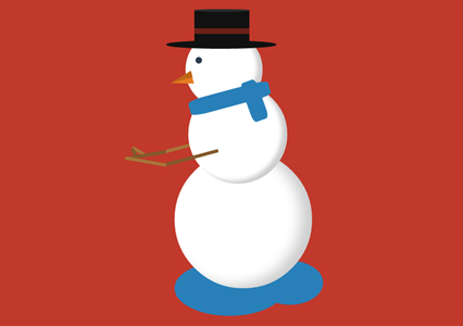
在圣诞节或者是元旦的时候,爱编程小编给大家分享一款纯css3实现的雪人动画特效。该实例实现一个雪人跳动的特效,效果图如下:
实现的代码。
html代码:
XML/HTML Code复制内容到剪贴板
<span class="text">lolwut<small>-@rsmswlln</small></span>
<div class="body">
<div class="hat">
<div class="ribbon">
</div>
</div>
<div class="face">
</div>
<div class="scarf">
</div>
<div class="right-arm">
<div class="hand">
</div>
</div>
<div class="left-arm">
<div class="hand">
</div>
</div>
</div>
<div class="puddle">
</div>
css代码:
CSS Code复制内容到剪贴板
body {
background: #c0392b;
}
.body {
width: 250px;
height: 250px;
background: #ffffff;
border-radius: 50%;
box-shadow: inset -20px -5px 35px rgba(0, 0, 0, 0.2);
position: absolute;
rightright: 0;
left: 0;
margin: 300px auto;
animation: jump 1s infinite;
}
.body:before {
z-index: 2;
content: "";
width: 180px;
height: 180px;
background: #ffffff;
border-radius: 50%;
box-shadow: inset -10px -5px 10px rgba(0, 0, 0, 0.2);
position: relative;
display: inline-block;
top: -120px;
left: 25px;
}
.body:after {
content: "";
width: 140px;
height: 140px;
background: #ffffff;
border-radius: 50%;
box-shadow: inset -10px -5px 10px rgba(0, 0, 0, 0.2);
position: relative;
display: inline-block;
top: -400px;
left: 20px;
}
.body > .hat {
width: 200px;
height: 15px;
border-radius: 50%;
background-color: #111111;
position: absolute;
z-index: 4;
top: -200px;
left: -15px;
}
.body > .hat:before {
content: "";
width: 100px;
height: 65px;
background-color: #111111;
display: inline-block;
position: relative;
top: -55px;
left: 51px;
}
.body > .hat:after {
z-index: 5;
content: "";
display: inline-block;
position: relative;
top: -145px;
left: 51px;
width: 100px;
height: 5px;
border-radius: 50%;
background-color: #2b2b2b;
}
.body > .hat > .ribbon {
height: 10px;
width: 100px;
background-color: #6d2018;
position: relative;
top: -90px;
left: 51px;
z-index: 6;
}
.body > .face {
z-index: 3;
width: 12px;
height: 12px;
background-color: #2c3e50;
border-radius: 50%;
position: absolute;
top: -170px;
left: 38px;
}
.body > .face:before {
content: "";
background-color: transparent;
display: inline-block;
position: relative;
top: 30px;
left: -45px;
transform: rotate(-15deg);
border-top: 12px solid transparent;
border-bottom: 12px solid transparent;
border-right: 40px solid #e67e22;
}
.body > .face:after {
content: "";
background-color: transparent;
display: inline-block;
position: relative;
top: 0;
left: -46px;
transform: rotate(-15deg);
border-top: 12px solid transparent;
border-right: 40px solid #bf6516;
}
.body > .scarf {
z-index: 3;
width: 150px;
height: 30px;
background-color: #2980b9;
position: absolute;
top: -110px;
left: 25px;
transform: rotate(-15deg);
border-radius: 20%;
}
.body > .scarf:after {
content: "";
width: 75px;
height: 30px;
background-color: #2980b9;
display: inline-block;
position: relative;
top: 16px;
left: 80px;
transform: rotate(85deg);
border-radius: 20%;
}
.body > .left-arm,
.body .rightright-arm {
z-index: 7;
width: 100px;
height: 6px;
background-color: #825a2c;
position: absolute;
top: 10px;
left: -20px;
transform: rotate(-15deg);
animation: rub-rightright 0.5s infinite;
}
.body > .left-arm > .hand,
.body .rightright-arm > .hand {
width: 25px;
height: 6px;
background-color: #825a2c;
position: absolute;
top: -32px;
left: -60px;
transform: rotate(75deg);
}
.body > .left-arm:after,
.body .rightright-arm:after {
content: "";
width: 75px;
height: 6px;
background-color: #a87439;
display: inline-block;
position: relative;
top: -24px;
left: -70px;
transform: rotate(25deg);
}
.body > .left-arm.left-arm,
.body .rightright-arm.left-arm {
background-color: #a87439;
animation: rub-left 0.5s infinite;
top: -15px;
z-index: 1;
}
.body > .left-arm.left-arm > .hand,
.body .rightright-arm.left-arm > .hand {
background-color: #a87439;
top: -14px;
transform: rotate(45deg);
}
.body > .left-arm.left-arm:after,
.body .rightright-arm.left-arm:after {
background-color: #825a2c;
transform: rotate(5deg);
top: -12px;
left: -74px;
}
.puddle {
z-index: -1;
width: 200px;
height: 100px;
background: #2980b9;
border-radius: 50%;
position: absolute;
rightright: 0;
left: -50px;
margin: 500px auto;
}
.puddle:after {
content: "";
width: 120px;
height: 80px;
display: inline-block;
border-radius: 50%;
left: 150px;
position: relative;
background-color: #2980b9;
}
.text {
text-align: center;
font-family: 'Lobster', cursive;
font-size: 74px;
display: inline-block;
transform: rotate(-15deg);
position: absolute;
margin: 50px 30px;
color: #ffffff;
text-shadow: 3px 3px 2px rgba(0, 0, 0, 0.5);
}
.text > small {
font-size: 20px;
display: block;
}
@keyframes rub-left {
0% {
margin-left: 0px;
margin-top: 0;
}
50% {
margin-left: 5px;
margin-top: 1px;
}
100% {
margin-left: 0px;
margin-top: 0;
}
}
@keyframes rub-rightright {
0% {
margin-left: 4px;
}
50% {
margin-left: 0px;
}
100% {
margin-left: 4px;
}
}
@keyframes jump {
0% {
margin: 300px auto;
}
40% {
margin: 250px auto;
}
80% {
margin: 300px auto;
}
}
到此,关于“怎么用css3制作元旦雪人动画特效”的学习就结束了,希望能够解决大家的疑惑。理论与实践的搭配能更好的帮助大家学习,快去试试吧!若想继续学习更多相关知识,请继续关注亿速云网站,小编会继续努力为大家带来更多实用的文章!
免责声明:本站发布的内容(图片、视频和文字)以原创、转载和分享为主,文章观点不代表本网站立场,如果涉及侵权请联系站长邮箱:is@yisu.com进行举报,并提供相关证据,一经查实,将立刻删除涉嫌侵权内容。


