这篇文章主要讲解了“基于React封装一个组件的方法是什么”,文中的讲解内容简单清晰,易于学习与理解,下面请大家跟着小编的思路慢慢深入,一起来研究和学习“基于React封装一个组件的方法是什么”吧!
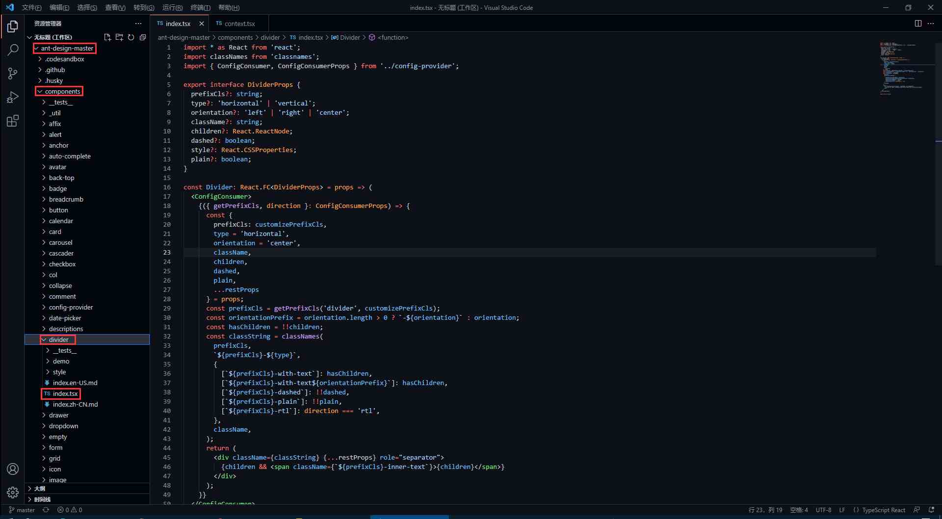
divider 组件在下图对应目录下 (代码我会拷贝过来,感兴趣的还是可以去克隆一下仓库)
antd 的源码使用了 TypeScript 语法,因此不了解语法的同学要及时了解哦!
import * as React from 'react';
import classNames from 'classnames';
import { ConfigConsumer, ConfigConsumerProps } from '../config-provider';
export interface DividerProps {
    prefixCls?: string;
    type?: 'horizontal' | 'vertical';
    orientation?: 'left' | 'right' | 'center';
    className?: string;
    children?: React.ReactNode;
    dashed?: boolean;
    style?: React.CSSProperties;
    plain?: boolean;
}
const Divider: React.FC<DividerProps> = props => (
    <ConfigConsumer>
        {({ getPrefixCls, direction }: ConfigConsumerProps) => {
            const {
                prefixCls: customizePrefixCls,
                type = 'horizontal',
                orientation = 'center',
                className,
                children,
                dashed,
                plain,
                ...restProps
            } = props;
            const prefixCls = getPrefixCls('divider', customizePrefixCls);
            const orientationPrefix = orientation.length > 0 ? `-${orientation}` : orientation;
            const hasChildren = !!children;
            const classString = classNames(
                prefixCls,
                `${prefixCls}-${type}`,
                {
                    [`${prefixCls}-with-text`]: hasChildren,
                    [`${prefixCls}-with-text${orientationPrefix}`]: hasChildren,
                    [`${prefixCls}-dashed`]: !!dashed,
                    [`${prefixCls}-plain`]: !!plain,
                    [`${prefixCls}-rtl`]: direction === 'rtl',
                },
                className,
            );
            return (
                <div className={classString} {...restProps} role="separator">
                    {children && <span className={`${prefixCls}-inner-text`}>{children}</span>}
                </div>
            );
        }}
    </ConfigConsumer>
);
export default Divider;在源码中,最先看到的是以下内容,这些属性也就是divider组件所暴露的属性,我们可以 <Divider type='vertical' /> 这样来传入 type 属性,那么 divider 分割线样式就会渲染为垂直分割线,是不是很熟悉!
export interface DividerProps { // interface 是 TypeScript 的语法
    prefixCls?: string;
    type?: 'horizontal' | 'vertical'; // 限定 type 只能传入两个值中的一个
    orientation?: 'left' | 'right' | 'center';
    className?: string;
    children?: React.ReactNode;
    dashed?: boolean;
    style?: React.CSSProperties;
    plain?: boolean;
}
在上面的属性中,我们还发现 className 和 style是比较常见的属性,这代表我们可以 <Divider type='vertical' className='myClassName' style={{width: '1em'}} /> 这样使用这些属性。
我们知道,antd 的组件类名会有他们独特的前缀 ant-,这是如何处理的呢?继续看源码。
<ConfigConsumer>
    {({ getPrefixCls, direction }: ConfigConsumerProps) => {
        const {
            prefixCls: customizePrefixCls,
            type = 'horizontal',
            orientation = 'center',
            className,
            children,
            dashed,
            plain,
            ...restProps
        } = props;
        const prefixCls = getPrefixCls('divider', customizePrefixCls);
从源码中,我们发现 prefixCls ,这里是通过 getPrefixCls 方法生成,再看看 getPrefixCls 方法的源码,如下。
export interface ConfigConsumerProps {
  ...
  getPrefixCls: (suffixCls?: string, customizePrefixCls?: string) => string;
  ...
}
const defaultGetPrefixCls = (suffixCls?: string, customizePrefixCls?: string) => {
  if (customizePrefixCls) return customizePrefixCls;
  return suffixCls ? `ant-${suffixCls}` : 'ant';
};
不难发现此时会生成的类名前缀为 ant-divider 。
我们封装的组件肯定是有预设的样式,又因为样式要通过类名来定义,而我们传入的属性值则会决定组件上要添加哪个类名,这又是如何实现的呢?下面看源码。
import classNames from 'classnames';
const classString = classNames(
    prefixCls,
    `${prefixCls}-${type}`,
    {
        [`${prefixCls}-with-text`]: hasChildren,
        [`${prefixCls}-with-text${orientationPrefix}`]: hasChildren,
        [`${prefixCls}-dashed`]: !!dashed,
        [`${prefixCls}-plain`]: !!plain,
        [`${prefixCls}-rtl`]: direction === 'rtl',
    },
    className,
);
return (
    <div className={classString} {...restProps} role="separator">
        {children && <span className={`${prefixCls}-inner-text`}>{children}</span>}
    </div>
);
我们发现,它通过 classNames 方法)定义了一个所有类名的常量,然后传给了 div 中的 className 属性。
其实生成的类名也就是 ant-divider-horizontal 这个样子,那么css中以此类名定义的样式也就自然会生效了。而 className 和 style 属性则是通过 {...restProps} 来传入。
最后我们再看看它的css样式代码是怎么写的!
antd 组件的样式使用 Less 书写,不了解 Less 语法的同学一定要了解一下。
@import '../../style/themes/index';
@import '../../style/mixins/index';
@divider-prefix-cls: ~'@{ant-prefix}-divider'; // 可以看到这里对应的也就是之前说到的类名前缀
.@{divider-prefix-cls} {
  .reset-component();
  border-top: @border-width-base solid @divider-color;
  &-vertical { // 这里的完整类名其实就是 ant-divider-vertical, 也就是 divider 组件的 type 属性值为 vertical 时对应的样式
    position: relative;
    top: -0.06em;
    display: inline-block;
    height: 0.9em;
    margin: 0 8px;
    vertical-align: middle;
    border-top: 0;
    border-left: @border-width-base solid @divider-color;
  }
  &-horizontal {
    display: flex;
    clear: both;
    width: 100%;
    min-width: 100%;
    margin: 24px 0;
  }
  &-horizontal&-with-text {
    display: flex;
    margin: 16px 0;
    color: @heading-color;
    font-weight: 500;
    font-size: @font-size-lg;
    white-space: nowrap;
    text-align: center;
    border-top: 0;
    border-top-color: @divider-color;
    &::before,
    &::after {
      position: relative;
      top: 50%;
      width: 50%;
      border-top: @border-width-base solid transparent;
      // Chrome not accept `inherit` in `border-top`
      border-top-color: inherit;
      border-bottom: 0;
      transform: translateY(50%);
      content: '';
    }
  }
  &-horizontal&-with-text-left {
    &::before {
      top: 50%;
      width: @divider-orientation-margin;
    }
    &::after {
      top: 50%;
      width: 100% - @divider-orientation-margin;
    }
  }
  &-horizontal&-with-text-right {
    &::before {
      top: 50%;
      width: 100% - @divider-orientation-margin;
    }
    &::after {
      top: 50%;
      width: @divider-orientation-margin;
    }
  }
  &-inner-text {
    display: inline-block;
    padding: 0 @divider-text-padding;
  }
  &-dashed {
    background: none;
    border-color: @divider-color;
    border-style: dashed;
    border-width: @border-width-base 0 0;
  }
  &-horizontal&-with-text&-dashed {
    border-top: 0;
    &::before,
    &::after {
      border-style: dashed none none;
    }
  }
  &-vertical&-dashed {
    border-width: 0 0 0 @border-width-base;
  }
  &-plain&-with-text {
    color: @text-color;
    font-weight: normal;
    font-size: @font-size-base;
  }
}
@import './rtl';
感谢各位的阅读,以上就是“基于React封装一个组件的方法是什么”的内容了,经过本文的学习后,相信大家对基于React封装一个组件的方法是什么这一问题有了更深刻的体会,具体使用情况还需要大家实践验证。这里是亿速云,小编将为大家推送更多相关知识点的文章,欢迎关注!
免责声明:本站发布的内容(图片、视频和文字)以原创、转载和分享为主,文章观点不代表本网站立场,如果涉及侵权请联系站长邮箱:is@yisu.com进行举报,并提供相关证据,一经查实,将立刻删除涉嫌侵权内容。


